Finishing the novel is the hard part.
Or at least, that’s what you tell yourself.
Then you open Microsoft Word and discover that you now have to turn 80,000 words into something that looks like an actual book.
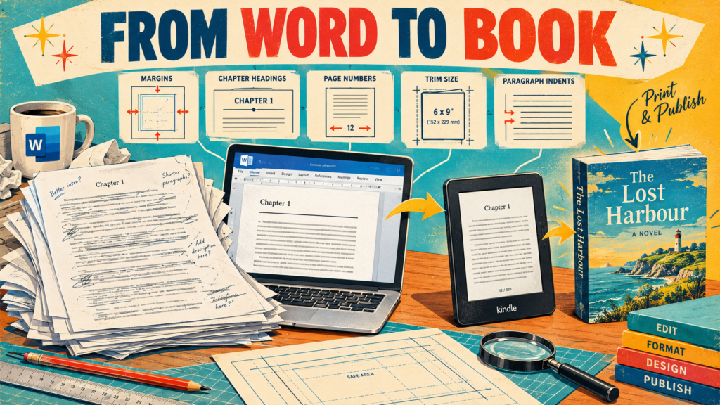
Suddenly you’re worrying about margins, chapter headings, page numbers, fonts, indents, blank pages, tables of contents and whether that strange gap between two paragraphs is supposed to be there.
This is where a lot of writers make a mistake.
They start formatting the book as though Microsoft Word is a glorified typewriter.
It isn’t.
Word is perfectly capable of producing a professional-looking book, but only if you use it properly. And if you’re publishing both a Kindle edition and a paperback through Amazon KDP, you need to understand one important thing from the beginning:
A Kindle book and a printed book should not be formatted identically.
The words are the same.
The document isn’t.
First: Don’t Format While You’re Writing
If you’re still writing the novel, don’t spend hours making Chapter 17 look beautiful.
You will only have to do it again.
Worse, you’ll probably create formatting problems that become increasingly difficult to find as the manuscript grows.
During drafting, concentrate on the words.
Use straightforward styles. Keep your manuscript clean. Don’t manually position everything on the page.
Once the novel is finished and properly edited, create your publishing versions.
This distinction will save you an astonishing amount of frustration.
Start With Styles, Not Manual Formatting
This is probably the single most important piece of advice in the entire article.
Use Word’s Styles.
Don’t manually select every chapter heading and make it 24-point bold.
Don’t hit Tab five times to indent a paragraph.
Don’t press Enter repeatedly to move something down the page.
Those methods might make the page look right on your monitor, but they create a horrible document underneath.
Instead, use styles such as:
- Normal
- Heading 1
- Heading 2
- Title
KDP specifically recommends using Heading 1 for chapter titles because it helps create the table of contents and gives your chapter formatting consistency.
Once you’ve created a style, change the style rather than individually formatting every occurrence.
That’s what styles are for.
Your Basic Novel Text
For a conventional fiction manuscript, keep things simple.
Your body text should normally have:
- One readable serif typeface
- Consistent font size
- First-line paragraph indentation
- No extra blank line between ordinary paragraphs
- Consistent line spacing
For a Kindle version, KDP’s own Word guidance recommends modifying the Normal style with a 0.2-inch (5 mm) first-line indent, zero spacing before and after paragraphs, and single line spacing. It also specifically warns against using tabs for paragraph indentation because they don’t convert properly to Kindle.
In Word:
Home → Styles → right-click Normal → Modify → Format → Paragraph
Set your indentation and spacing there.
Then your entire manuscript follows the same rules.
That’s much better than fixing 80,000 words one paragraph at a time.
Chapter Headings
Every chapter should begin consistently.
For example:
CHAPTER ONE
or:
1
or:
Chapter One
There isn’t a single correct choice.
What matters is that your choice suits the book and remains consistent.
Select the chapter heading and apply Heading 1.
Then modify Heading 1 to look the way you want.
For a printed novel, you might use something like:
Chapter One
18–24 pt
Centred
Generous space above and below
You don’t need to go mad.
This isn’t a wedding invitation.
The reader came for the story.
Start Every Chapter Properly
Don’t create a new chapter by pressing Enter repeatedly until you reach a new page.
Use a page break or, for print formatting where appropriate, a section break.
KDP recommends section breaks for paperback chapter starts because they allow the formatting of different sections of the book to be controlled independently.
In Word:
Layout → Breaks → Next Page
For a simple Kindle manuscript, a page break at the end of each chapter is generally sufficient.
The important thing is that Chapter Two doesn’t begin halfway down the same screen because you happened to delete a paragraph during editing.
Kindle Formatting Is Reflowable
This is the biggest conceptual difference.
A printed page has fixed dimensions.
A Kindle screen doesn’t.
The reader can change:
- Font
- Font size
- Line spacing
- Orientation
- Device
So trying to control exactly where every line appears is pointless.
The Kindle version is reflowable.
KDP supports DOC/DOCX, EPUB and KPF among its main eBook formats, and Kindle Create can turn a Word document into a reflowable Kindle book.
That means you shouldn’t try to make the Kindle version look exactly like your paperback.
You can’t.
And you shouldn’t want to.
The Kindle Table of Contents
Your Kindle book should have navigation that actually works.
Again, this is where Word’s Heading 1 style becomes useful.
If every chapter is correctly marked as Heading 1, Word can create a table of contents from those headings, and Kindle Create can use the chapter titles to build the interactive Kindle TOC.
Go to:
References → Table of Contents
Choose an automatic option.
But don’t just glance at it and assume it’s working.
Click the entries.
Check that they actually take you to the correct chapter.
A table of contents that looks professional but sends the reader to the wrong place is still broken.
Front Matter for Kindle
A straightforward fiction eBook might contain:
Title page
Book title
Author name
Copyright page
Copyright information and other relevant details.
Dedication
If you have one.
Table of Contents
Then:
Chapter One
You may also have:
- Prologue
- Epigraph
- Acknowledgements
- About the Author
- Other books by the author
Don’t feel obliged to include every possible piece of front matter simply because you’ve seen it in another book.
If it doesn’t serve a purpose, leave it out.
The Paperback Is a Different Beast
Now we get to print.
This is where page size becomes important.
KDP calls the physical dimensions of the finished book its trim size. A common paperback size is 6 × 9 inches, although KDP offers several alternatives.
For a conventional novel, choose a trim size that suits the genre and the physical reading experience you’re aiming for.
Then set Word to that size:
Layout → Size → More Paper Sizes
Enter your chosen width and height.
Do this before finalising your margins.
Why?
Because changing the page size changes the page count.
And page count affects your inside margin.
KDP explicitly recommends setting the trim size before setting margins.
Margins Matter More Than You Think
The outside margins give the page breathing room.
The inside margin—the gutter—has another job.
It has to allow for the fact that the book is physically bound.
The thicker the book, the more gutter space you need.
KDP’s current minimum inside margins are:
| Page count | Minimum inside margin |
|---|---|
| 24–150 | 0.375″ |
| 151–300 | 0.5″ |
| 301–500 | 0.625″ |
| 501–700 | 0.75″ |
| 701–828 | 0.875″ |
The outside margin must be at least 0.25 inches for a no-bleed interior.
But don’t treat those figures as your target merely because Amazon allows them.
Minimum isn’t the same as attractive.
A book can technically pass KDP’s requirements and still look cramped and cheap.
For a normal novel, give the page some air.
Use Mirror Margins
A printed book has a left-hand page and a right-hand page.
The inside edge changes sides.
That’s why you should use Mirror Margins in Word.
Go to:
Layout → Margins → Custom Margins
Then select:
Multiple pages → Mirror margins
This allows Word to treat the inside and outside edges correctly. KDP specifically recommends this setup for paperback interiors.
This is one of those things that looks insignificant on your screen and becomes very obvious when you’re holding the finished book.
Headers and Page Numbers
You don’t necessarily need elaborate headers in a novel.
In fact, I’d argue that many self-published novels look worse because the author has tried too hard.
A simple running header containing the author name or book title can work.
Page numbers are more important.
Typically, you don’t want the number appearing on the title page.
You may also choose to leave chapter-opening pages without visible page numbers.
Word’s section breaks allow you to control this.
Again:
Don’t fake it with blank lines.
Use sections.
KDP notes that different pagination styles can be created with section breaks, although Roman numerals in front matter aren’t typical for many novels.
Do You Need Bleed?
For a normal text-only novel:
Probably not.
Bleed is relevant when something on the page reaches the physical edge—such as a photograph, illustration or full-page background.
If you have an image that reaches the edge, KDP requires the entire interior file to be set up with bleed.
For a 6 × 9 inch book, for example, a bleed document becomes 6.125 × 9.25 inches.
For a conventional novel containing nothing but text, don’t introduce bleed just because it sounds professional.
It isn’t.
It’s unnecessary.
Your Print File Should Usually Become a PDF
Once your paperback interior is finished, don’t simply assume the Word document is the final product.
For a print-ready manuscript, export it to PDF and inspect that PDF.
KDP accepts PDF for print, and if your manuscript contains bleed, PDF is required.
The important point is this:
Your PDF is what you’re actually asking the printer to reproduce.
So inspect it.
Don’t trust Word’s editing view.
The Kindle File Should Be Treated Separately
Here’s the workflow I’d recommend.
Keep your master manuscript in Word.
Then make:
Novel_Master.docx
From that, create:
Novel_Kindle.docx
and:
Novel_Print.docx
The Kindle version gets simplified, reflowable formatting.
The print version gets:
- Trim size
- Mirror margins
- Page numbers
- Headers if wanted
- Carefully controlled chapter pages
- Print typography
- Final PDF export
This is much cleaner than trying to make one document simultaneously satisfy two completely different publishing environments.
Kindle Create Is Worth Considering
If you’re uncomfortable with ebook formatting, don’t make life harder than necessary.
KDP’s Kindle Create can import DOC/DOCX and create a reflowable eBook. It can also prepare paperback interiors from the same manuscript, with the software handling various formatting tasks.
For a straightforward text-heavy novel, that’s a perfectly sensible route.
You can import the Word manuscript, identify chapter titles, apply styles, create the interactive table of contents and preview the result.
Then export the Kindle file for KDP.
KDP specifically recommends Kindle Create for text-heavy books with simple layouts.
Preview Everything
This is the step that separates “I’ve uploaded a Word document” from “I’ve actually published a book.”
For Kindle, use Kindle Previewer.
Look at the book on different simulated devices and font sizes.
Check:
- Chapter starts
- Paragraph indents
- Italics
- Scene breaks
- Dialogue
- Table of contents
- Images
- Front matter
- Back matter
KDP specifically recommends previewing Kindle books before publication because formatting can change during conversion.
For print, use KDP’s Print Previewer and, ideally, order a physical proof.
The physical proof matters.
A PDF can look perfectly acceptable on your monitor while the printed book reveals:
- cramped gutters
- awkward chapter pages
- inconsistent spacing
- orphaned lines
- headers in the wrong place
- pages that feel visually unbalanced
The Formatting Mistakes I Would Avoid
There are some habits I would actively ban from a novel manuscript.
Don’t use spaces to align text.
Use paragraph alignment.
Don’t use tabs for paragraph indents.
Set the first-line indentation in the style.
Don’t press Enter ten times to create a new page.
Use a page break or section break.
Don’t use multiple fonts throughout the novel.
You aren’t designing a nightclub flyer.
Don’t justify everything blindly.
It can work beautifully in print, but inspect the resulting word spacing.
Don’t manually type your table of contents.
Use Word’s heading structure.
Don’t format Kindle by copying your paperback.
They’re different formats.
Don’t skip the preview.
The preview is part of the formatting process, not an optional final glance.
The Simple Workflow I’d Use
If I were preparing a novel for KDP today, I’d do it in this order:
1. Finish the manuscript.
No fancy formatting.
2. Edit it properly.
Formatting doesn’t fix bad writing.
3. Apply Word styles.
Normal for body text. Heading 1 for chapters.
4. Create the Kindle version.
Keep it clean and reflowable.
5. Create the print version.
Set trim size, mirror margins, chapter pages, headers and pagination.
6. Create the table of contents.
Check every link.
7. Export the print version to PDF.
8. Open the Kindle version in Kindle Previewer.
9. Upload the print PDF to KDP and inspect it in Print Previewer.
10. Order a proof copy.
Then hold the bloody thing in your hands.
That’s when you find the mistakes you somehow couldn’t see after reading the manuscript fifty times.
The Most Important Thing to Remember
Formatting is not decoration.
It is communication.
A good layout gets out of the reader’s way.
They shouldn’t be thinking:
That’s a strange margin.
Why is this chapter halfway down the page?
Why has the font suddenly changed?
Why is there a massive gap here?
They should be reading your story.
That’s the whole point.
And don’t fall into the trap of thinking that professional formatting means adding more stuff.
It usually means removing unnecessary stuff.
A professional novel is restrained.
Consistent.
Readable.
Invisible.
The reader should notice your writing—not your Word document.
And if you’re publishing both Kindle and paperback, accept from the start that you’re producing two editions of the same book, not one file that happens to work twice.
Get that right, and the technical side becomes considerably less intimidating.
More importantly, you can stop worrying about margins and page breaks and get back to the thing that actually matters.
Writing the next bloody novel.
There is a particular moment every writer dreams about. You type the final sentence. You write THE END. You sit back, perhaps with a cup . . .
There’s a particular kind of misery that writers know well. You sit down, you open the document, and you stare at the cursor blinking back . . .
There’s a lie that gets repeated so often it’s practically tradition. Someone finds out you’re a writer, and within thirty seconds, they’ve said it: “Oh, . . .

“I’ve got a good idea… but I don’t think it’s big enough for a novel.” That sentence has quietly killed more books than lack of . . .